Daily Mail - DMG Media
Skills used: UI, Basic UX, User Research, Prototyping, Agile, Art Direction
DMG Media, formerly Associated Newspapers, is a national newspaper and website publisher in the UK. DMG Media owns the Daily Mail, MailOnline, the Mail on Sunday, Metro, Wowcher, Jobsite and Jobrapido. Its portfolio of national newspapers, websites and mobile and tablet applications regularly reach 67% of the GB adult population.
Role: UX visual designer
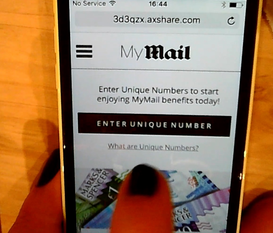
I was a member of the User Experience team where I worked across a range of the Mail’s digital products (You Beauty Box, MyMail, Mail Finance and Mail Travel). My main role was to visually translate UX customer journeys and help in basic wire framing and user research.
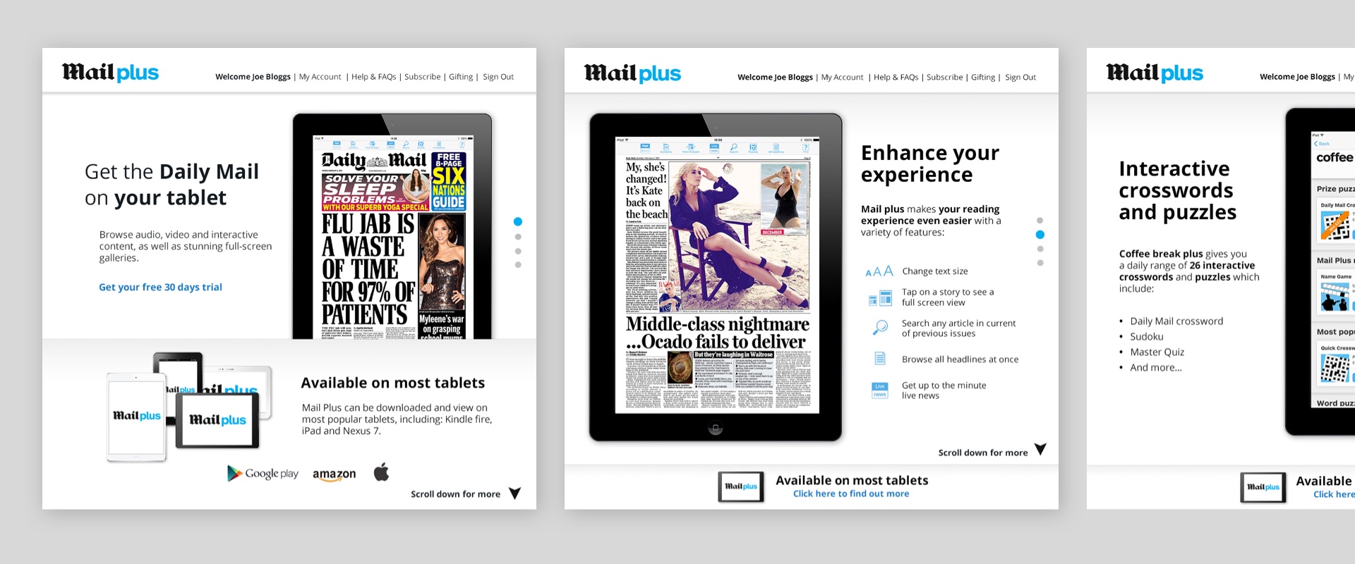
Below are some designs for the landing page for the Mail Plus site.
Creation of the You Beauty Box site
I was really happy to be lead designer in the creation of the YBB site. The process led me to work and collaborate with UX, internal and external development teams as well as art direct in the photography of products for the site.
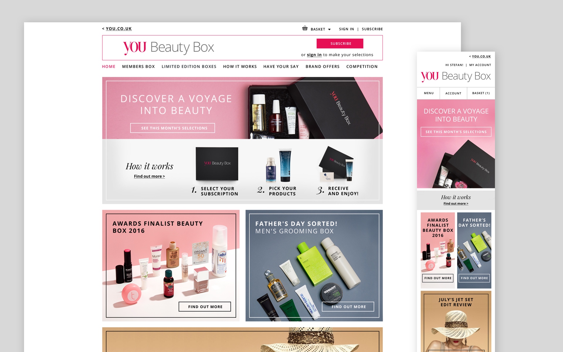
As well as work on the creation of the site I was given the chance to rebrand the YBB logo which was approved and printed on the gift box.
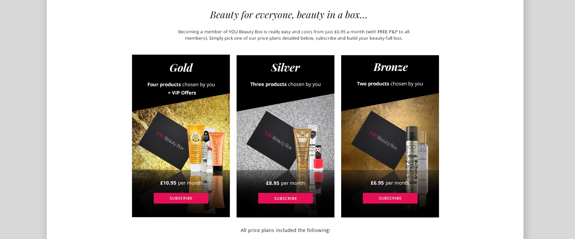
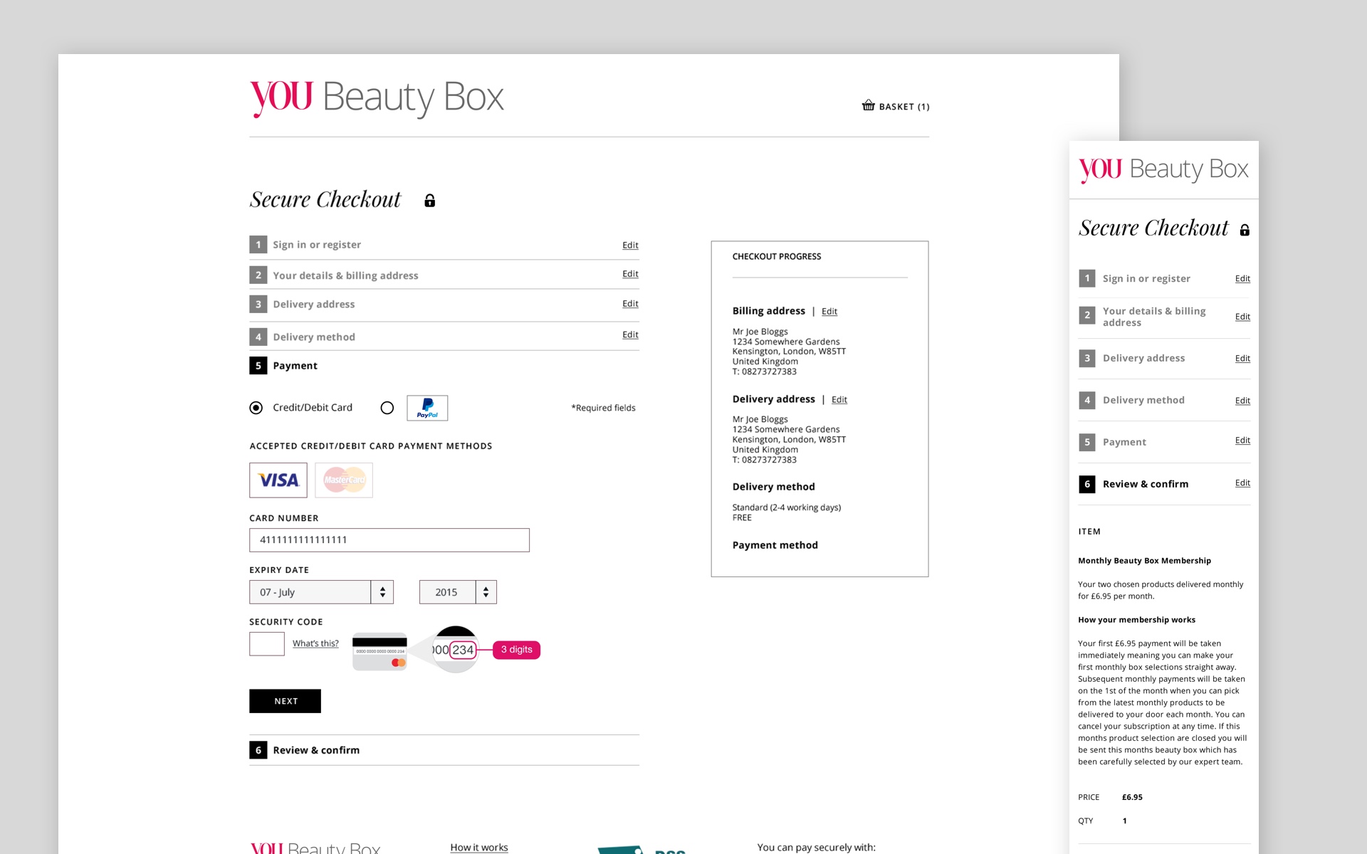
What I really enjoyed about working on this project was that I was given the chance to have a much more active say in the visual shaping of the customer journey from landing page to check out.
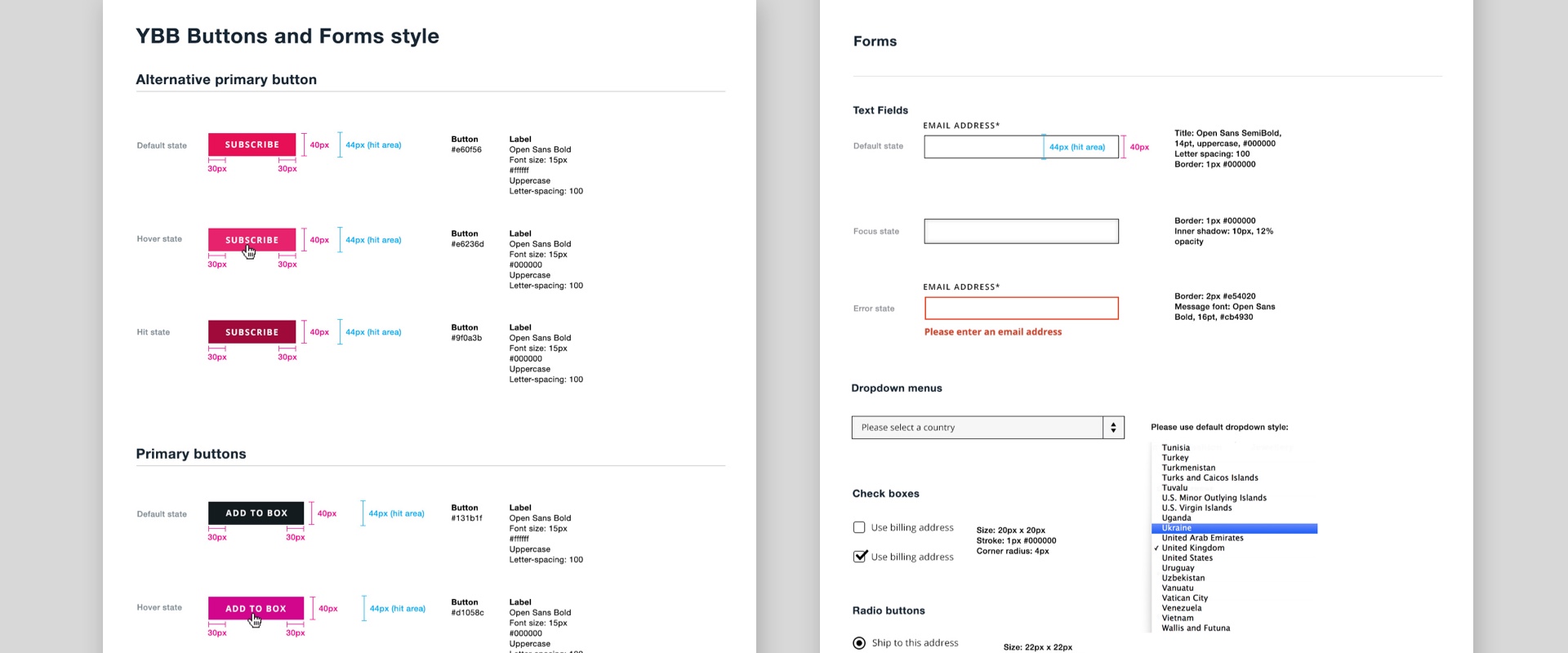
The YBB site style that I created was based on and evolved from it’s parent site you.co.uk’s style guide.
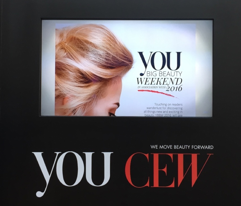
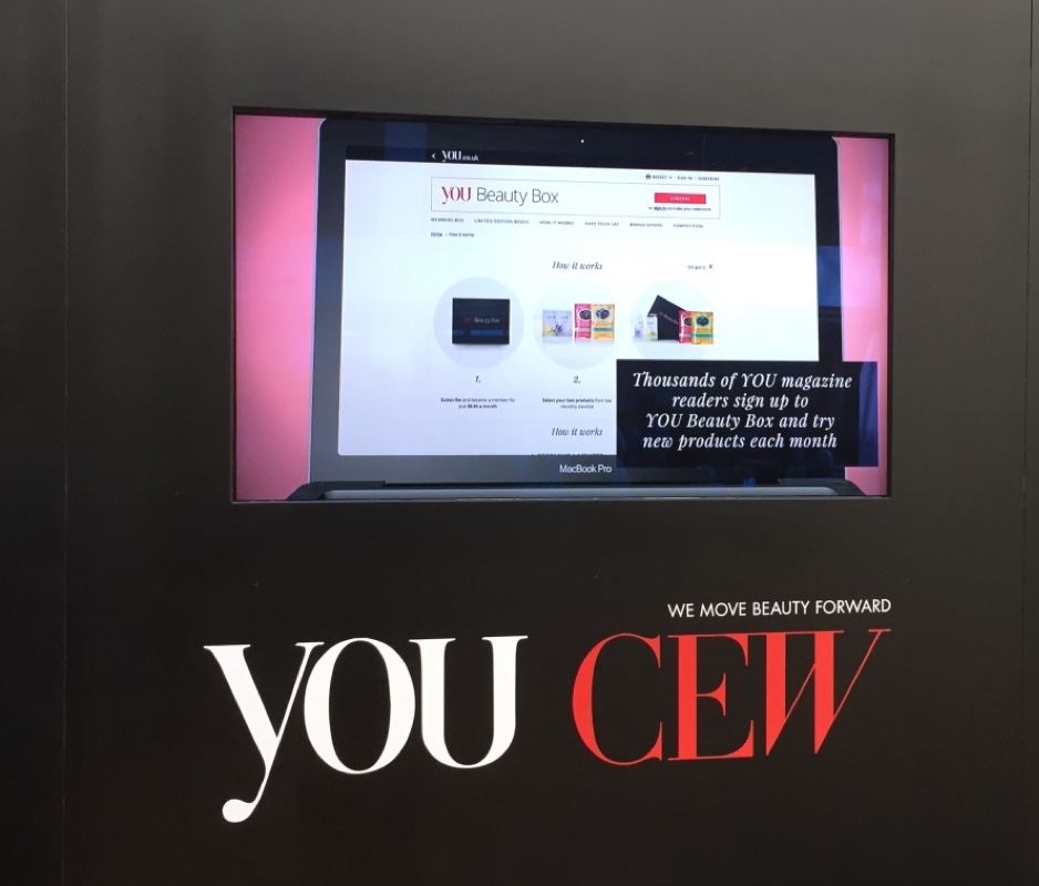
The final designed and developed website was showcased at the You Big Beauty Weekend 2016, below are a couple of photos where it was showcased at the soft launch.
Components blocks and collaboration with development teams
Because we worked with a lot of external development teams not only based in the UK but in India as well, it was very easy for designs to get lost in communication and translation.
One of the main ways we tried to protect ourselves against was to make sure all designs were specced up. Another way was to make our designs, component based and show the developers by creating a guide showcasing all the different scenarios of those components.
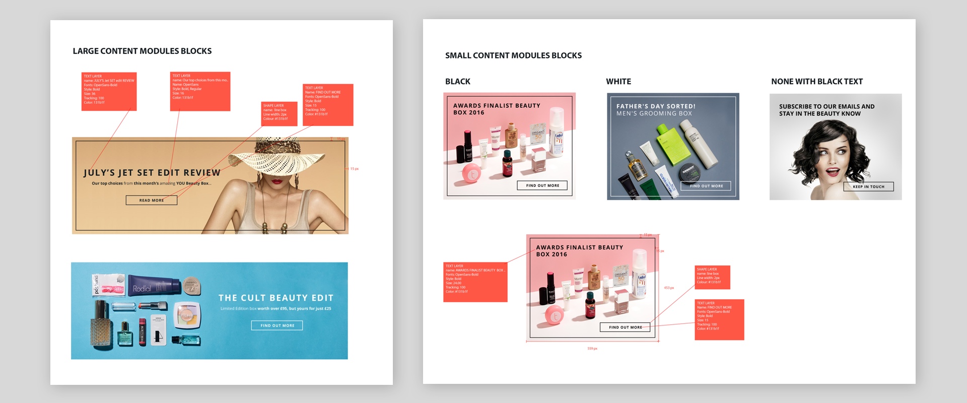
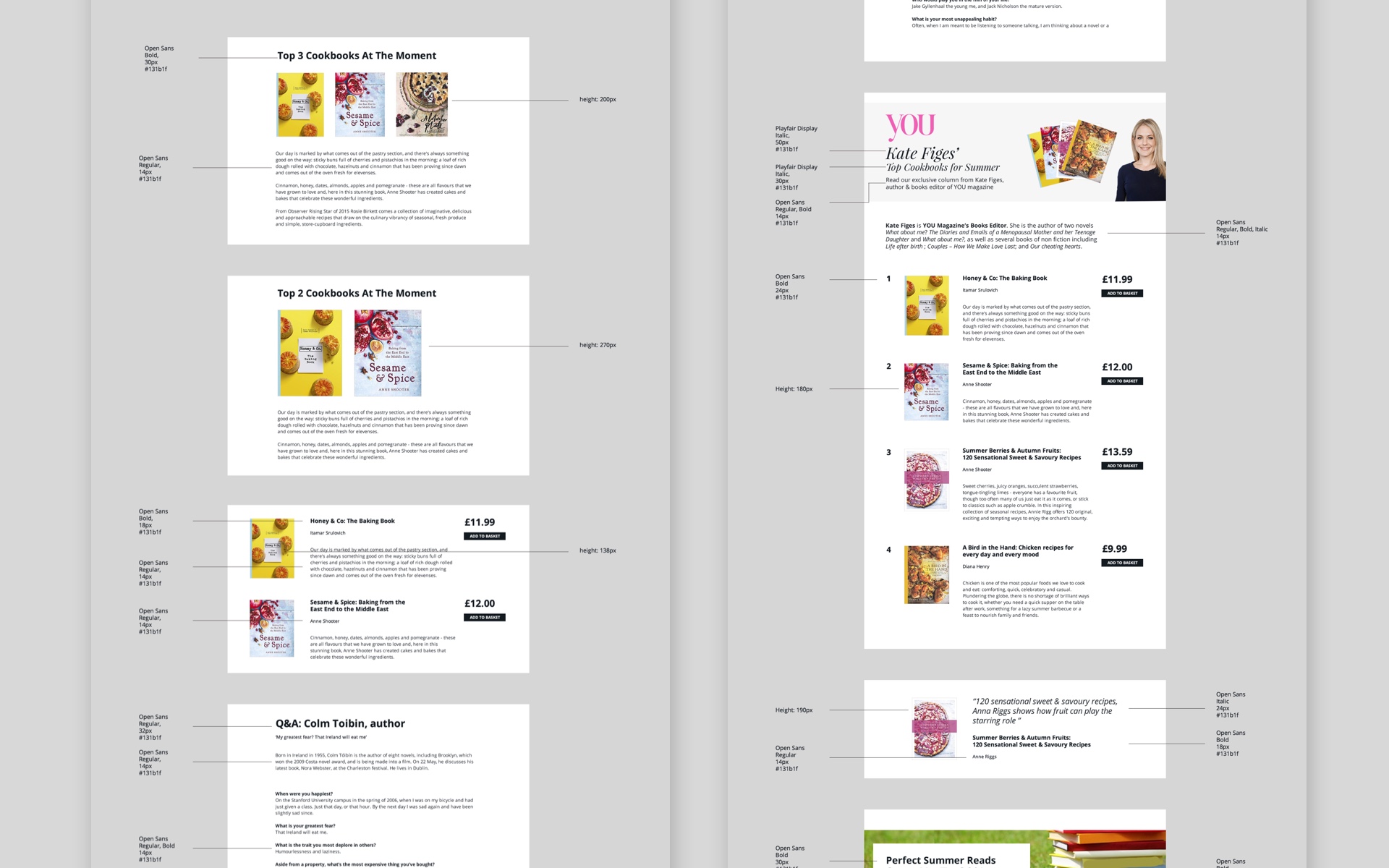
Above is a sample of the guide for the You Beauty Box site and is sample for the Mail Books site.
Wireframing
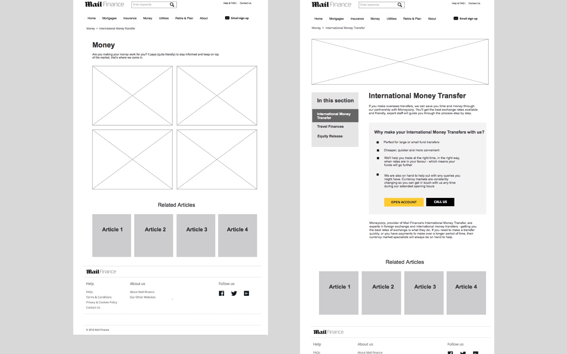
The bulk of the wire framing was left in the domain of UX designers in our team, but I was given the chance to take over when the customer journeys were basic.
Below are a sample of some wire frames I did for the Mail Finance site, the purpose was to simplify the pages so it would be more navigable for the user.
User testing and collecting qualitative and quantitative data
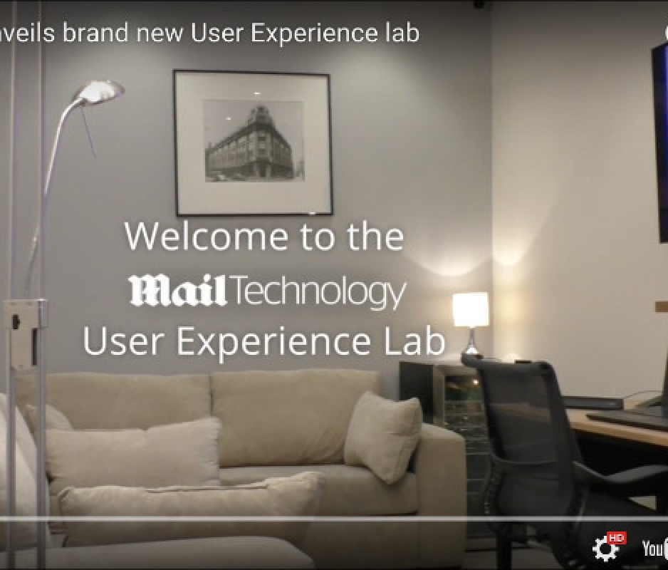
One of the great things for working for a large company like Daily Mail was that it had the budget to create its own UX lab. It consisted of two rooms one for observation and one for conducting interviews and testing out prototype designs on participants.
Even though I didn’t conduct the interviews I collaborated with our in house user researcher and UX designers in deciding what to test out, observing the interviews and what data we could use to influence our final design.
